 Short Answer Type
For the following data, draw a histogram.
|
Age (in years) |
Number of persons |
|
0–6 |
8 |
|
6–12 |
12 |
|
12–18 |
15 |
|
18–24 |
18 |
|
24–30 |
12 |
|
30–36 |
4 |
Draw a histogram representing the following frequency distribution:
|
Marks |
No. of students |
|
0–10 |
3 |
|
10–20 |
5 |
|
20–30 |
8 |
|
30–40 |
10 |
|
40–50 |
7 |
|
50–60 |
2 |
Construct a histogram and frequency polygon for the following data:
|
Monthly school fee र |
No. of schools |
|
600–800 |
5 |
|
800–1000 |
12 |
|
1000–1200 |
14 |
|
1200–1400 |
18 |
|
1400–1600 |
10 |
|
1600–1800 |
9 |
The following table gives the distribution of 60 students according to marks obtained by them
|
Marks |
Frequency |
|
0–10 |
3 |
|
10–20 |
9 |
|
20–30 |
18 |
|
30–40 |
16 |
|
40–50 |
12 |
|
50–60 |
2 |
Draw the frequency polygon for the above data.
The following table gives the life times of 400 neon lamps:
|
Life time (in hours) |
Number of lamps |
|
300–400 |
14 |
|
400–500 |
56 |
|
500–600 |
60 |
|
600–700 |
86 |
|
700–800 |
74 |
|
800–900 |
62 |
|
900–1000 |
48 |
Represent the above information with the help of a frequency polygon.
The following data gives the number (in thousands) of applicants registered with an Employment Exchange during 2005–2010.
|
Year |
No. of applicants registered (in thousand) |
|
2005 |
19 |
|
2006 |
21 |
|
2007 |
23 |
|
2008 |
30 |
|
2009 |
32 |
|
2010 |
36 |
Construct a bar graph to represent the above data.

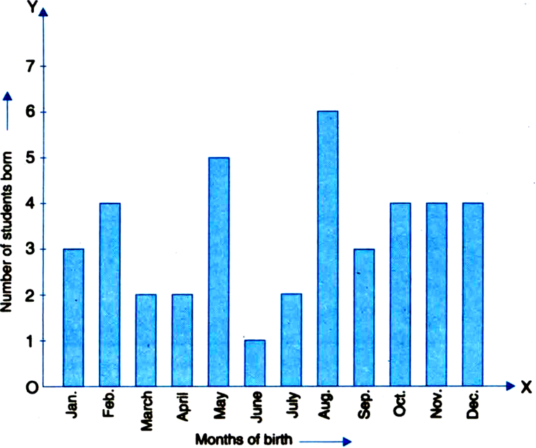
Observe the bar graph given above and answer the following questions:
(i) How many students were born in the month of November?
(ii) In which month were the maximum number of students born?
A family with monthly income of Rs. 20,000 had planned the following expenditures per month under various heads:
|
Heads |
Expenditure (in Rs. 1000) |
|
Grocery |
4 |
|
Rent |
5 |
|
Education of children |
5 |
|
Medicine |
2 |
|
Fuel |
2 |
|
Entertainment |
1 |
|
Miscellaneous |
1 |
Draw a bar graph for the data above.
Consider the marks, out of 100, obtained by 51 students of a class in a test:
|
Marks |
Number of students |
|
0–10 |
5 |
|
10–20 |
10 |
|
20–30 |
4 |
|
30–40 |
6 |
|
40–50 |
7 |
|
50,60 |
3 |
|
60–70 |
2 |
|
70–80 |
2 |
|
80–90 |
3 |
|
90–100 |
9 |
|
Total |
51 |
Draw a frequency polygon corresponding to this frequency distribution table.
In a city, the following weekly observations were made in a study on the cost of living index:
|
Cost of living index |
Number of weeks |
|
140–150 |
5 |
|
150–160 |
10 |
|
160–170 |
20 |
|
170–180 |
9 |
|
180–190 |
6 |
|
190–200 |
2 |
|
Total |
52 |
Draw a frequency polygon for the data above (without constructing a histogram).
